TCN
Corporate Brand Identity and Design System for a Community as Service Logistics Company
Brand Identity
Logistics

The Brief
Create a visual identity and foundational UI/UX system for TCN, a modern community-as-a-service platform inspired by legacy organizations such as WCA.
The challenge was to create something contemporary, scalable and digital-first while preserving the sense of trust and community associated with traditional networks.
My Role : Brand Identity Designer & Systems Designer
Brand Strategy · Identity Design · UI Foundations · Design Systems · Handover Documentation
The Challenge
The founder had strong preferences regarding the logo and its application, which meant the broader identity system needed to work harder to ensure flexibility and longevity.
The objective became building an ecosystem around the mark rather than relying solely on it.
Building the System
A major focus of the project was ensuring the identity could withstand the demands of product design and interface environments without losing clarity or character.
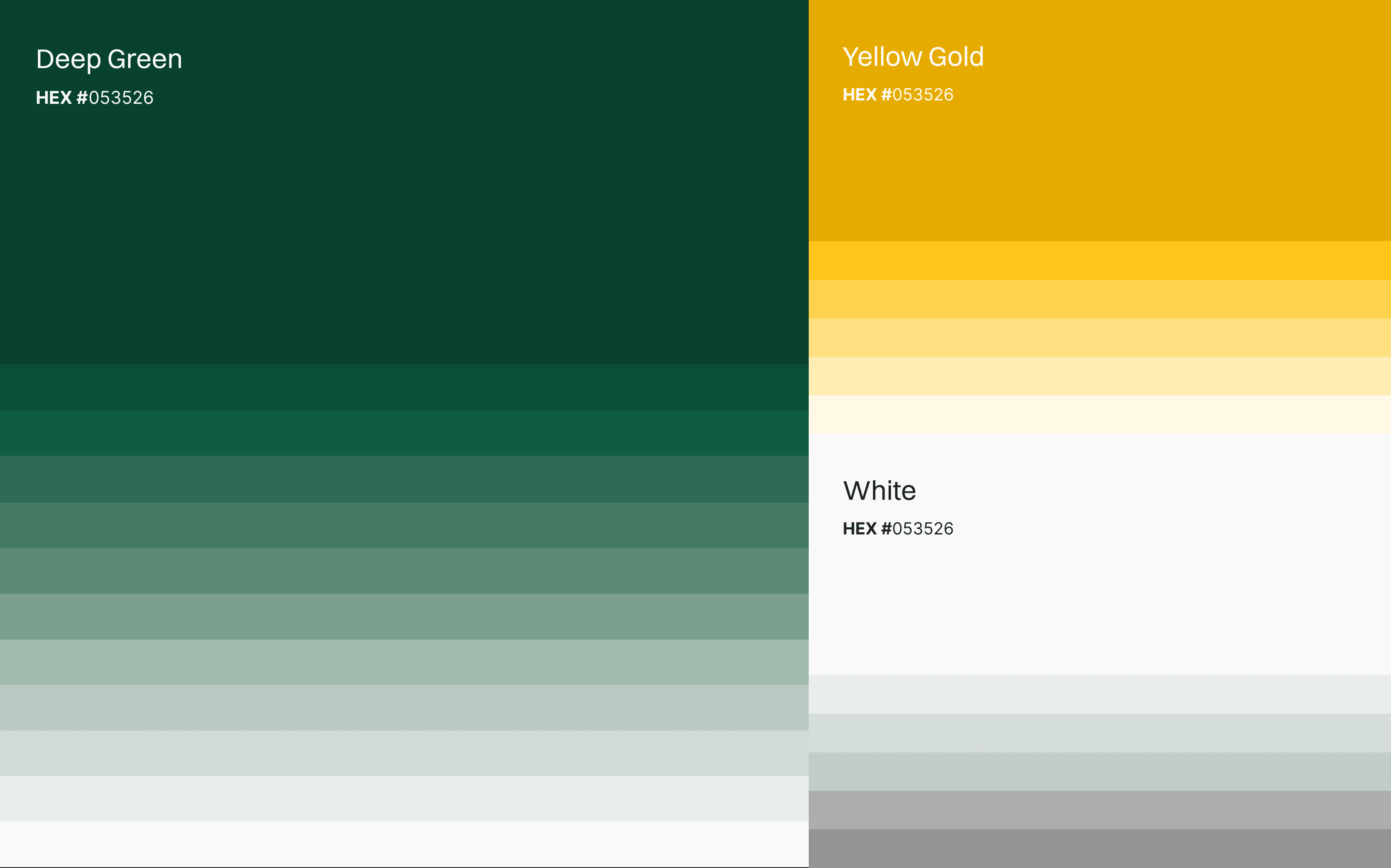
Typography, spacing, colour behaviour and component logic were developed with digital applications in mind from the outset.

The Outcome
The result was a robust identity and design foundation that could comfortably transition into product development and support handover to a dedicated UI/UX team.

Design Approach
The goal was to create a brand system that wouldn't collapse under UI and UX requirements as the platform evolved.
Every decision was made with scalability, consistency and implementation in mind.